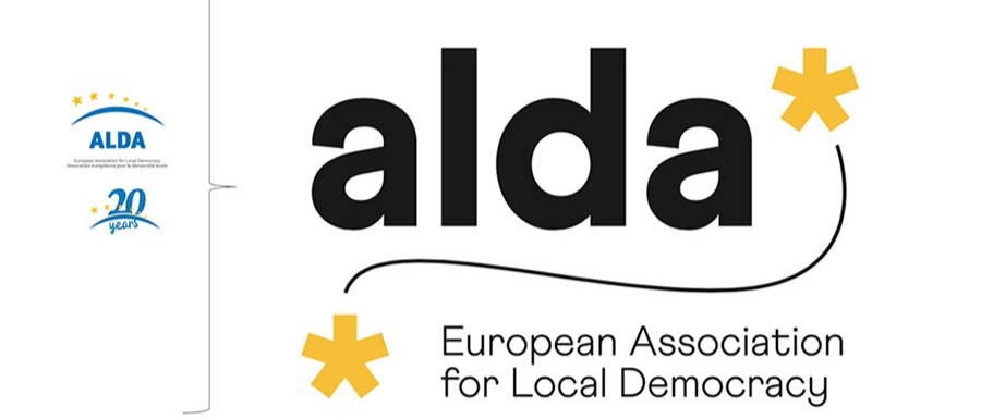
We have a new logo! In the occasion of our 20th anniversary, we decided to make sure that our looks be fully representative of the Association as it is today, of its work, core values and key messages.
Hence, to begin with, the lowercase as a metaphor for our proximity and attention to each person and to their experience: alda* is for the citizen! Then, the asterisk: a small but significant symbol that serves as connection with words and worlds, topics and thoughts, just like the Association wishes to do. And one asterisk referring to another asterisk forms a line, a visual path, just like the work that alda* does on European territory and beyond – as a community of communities.
Last but not least, a reassurance for those who may feel nostalgic of the blue in the old logo, as the official “negative” of the logo features white writing, yellow asterisks and a perfectly blue background, in recognition of the Association’s origins and of its structural, important ties with the European Union and its institutions.
And the best is yet to come: ready for a website revolution coming soon, too? Keep in touch and join us in more and more 20th anniversary celebrations throughout this second half of 2020!
With many thanks to the expert work of Lino’s & Co., Verona (Italy)!
